Mondo Lighting Interview

15/01/2013
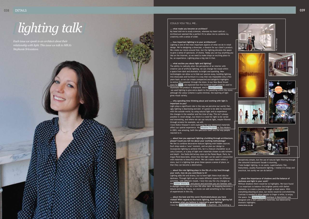
Stephanie Srivastava speaks to Mondo Lighting in Issue 70 — Dec 2012 / Jan 2013
Each issue Mondo Lighting speaks to an architect about their relationship with light. In the latest issue Mondo talks to MRA's own Stephanie Srivastava. In this retail special edition, Mondo takes to the shopping streets of London to look at Regent Street, now a world class shopping destination. Here's the interview in full:
What made you become an architect?
My head told me to study sciences, whereas my heart said art... Architecture seemed like a perfect fit to allow me to combine my creativity with a sense of order.
How important lighting is to your architecture?
Lighting is one of the most important aspects of what we do in retail design. We’re designing a showcase, a theatre for our client’s product. We create our stores around that, but the lighting elevates the space to give a sense of spectacle, of drama. Today you can buy anything you like on the internet, so we need to make shops an exciting place to be, an experience. Lighting plays a big role in that.
What excites you about light and lighting?
The ability to radically alter the perception of an interior with creative use of artificial lighting; we can change the mood within a space from dark and dramatic to bright and sparkling. New technologies can allow us to hide our sources away, building lighting into showcases and furniture in a way that was impossible only a few years back, so we can create unexpected and delightful highlights to entice the customer through the store. In our New Bond Street store for Zilli , we explored how the furniture itself could be used to illuminate the product it displayed. And in Juicy Couture we used lighting to give extra depth to the panelling within the store; although the colour scheme is quite minimal, the layering of light gives visual variety.
Why spending time thinking about and working with light is important to you?
Light plays a significant role in the way we perceive our world; flat, ugly lighting is depressing and dull. It’s great to be able to reconnect with the outside world, by using natural light and to experience the changes in the weather and the time of day. This isn’t always possible in retail design, but there is a need for light to be varied and interesting, and where we can use natural light, maybe filtered through screens for example, we will. I love Olafur Eliasson’s work exploring the way elemental materials affect our spatial experience. His Weather Project at Tate Modern in 2003, was amazing, both the spectacle itself and the way people reacted to it.
Could you tell me about your working methodology? How do you approach lighting a building through architecture?
We like to combine decorative feature lighting with hidden sources. Each shop needs a ‘wow’ moment, and we plan our design to incorporate lighting to achieve this, be it a feature chandelier as at Juicy Couture, or a play of light over materials chosen to add richness and depth - the Stella McCartney store at the Palais Royal, Paris, by Angus Pond Associates, shows how the light can be used in conjunction with materials to beautiful effect. We can create rooms within a store, but it is lighting that gives these spaces a sense of place, so that they can become a destination.
What role does lighting play in the life of a city?
And through your work, how do you contribute to it?Lighting adds life and drama, but to have light there must also be darkness. Through light we can create different spaces for different activities, with different moods. I love the way the city changes as the winter draws in , and places and activities you are familiar with in daylight hours take on a new life after dark. As shopping becomes a leisure activity for many, our stores can add something to the variety of experiences in the city.
What are the best and the worst illuminated places you have visited? With regards to the worst lighting, how did the lighting fail to achieve what you believe is required in good lighting?
I love the Trinity Laban Conservatoire in Deptford - the building is deceptively simple, but the use of natural light filtering through the coloured translucent facade is stunning. I hate budget lighting, in car parks, supermarkets: flat, featureless, usually fluorescent lighting. I realise it’s cheap and practical, but surely we can do better?
What is the importance of shadows and the balance of darkness and light in your work?
Without shadows there would be no highlights. We have found it so important to balance the brighter points with darker moments, to create a journey through a retail space. With everything shouting at once, our stores would be overwhelming. Contrast is needed to allow people to linger a while, to enjoy the space. Our General Store boutique in Manchester was designed with a dark palette of materials, but balanced by dramatic highlights.